Tuesday, February 26, 2008

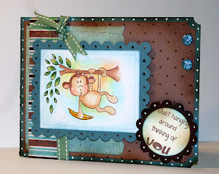
CCdesigns Monkey Love

This month's new set from CCdesigns are amazing! They are just so darn cute, and fun! Along with the new stamp set is some awesome backgrounds. Also, if you get a chance, check out my tutorial on creating a background paper over here.
recipe:
Stamps: CCdesigns Monkey Love and polka dot BG
Ink: Stewart Superior Hybrid Ink in Burnt Umber, Basic Brown, Ranger Distress in Vintage, and Broken China.
Paper: Bayou, Cocoa, Vanilla, Basic Grey ( striped) Blush DP, weathered BG created using tutorial: Here
Other: Prismacolor pencils, Twinkling H2O's, Wasabi ribbon, white gel pen, Jessie James glitter dots ( available at all that scraps ), Nestabilities, Stickles in Copper.

This next card is created using large Nestabilities circle.
Recipe:
stamps: CCdesigns Monkey Love
ink: Stewart Superior Burnt Umber
Paper: Bazzill and Arturo watercolor paper in Butter cream
Other: White gel pen, brown marker, re-inkers, Twinkling H2O's, brown grosgrain ribbon.
The cards are simple but fun. Have a great night. I won't be posting for a couple days, I have to run to the city for my daughters doctor's appointment.

Hugs,
Sophie

Monday, February 25, 2008

sketch tutorial Part 1


OK, this has been a long time in coming. I really had to sit down and think about how I was going to present this. I like to play around a lot with free hand elements, I find it comes in handy when you don't quite have what you are looking for in a stamp. Or when you just want to add some visual interest. If you look at the top photo, you will see a group of tools which I often use for freehand sketching. My tools include: Those shape templates used by graphic designers which you can find in any office supply store or art store. Next, pencil, good quality erasers, Copic multiliner pen for use with copic markers, Faber and Castel Pitt Artist pen. For the artist pen you will find three colors: black, sepia and sanguine which come with 4 types of tips, the finest being the ( s ). These pens also come in a varying range of colors fitted with brush tips. They are waterproof and suitable for color pencil and orderless mineral spirits as well as water color. The last two items shown are a CD and a Palette ink pad. These are just a sample of random items that can be used to create shapes. Oh ya also a ruler which is self explanatory.


Next is just my hand holding the pen. It does not matter if I am working with pencil, ink, water color or any other medium, I always hold my instrument at a comfortable angle that I can maintain. Important points are steadiness of hand, and the ability to put light pressure or greater force.
Now this is a bit of a weird picture, but I wanted something simple to explain this next step. Everything is made up of shapes. When you learned to draw squares, triangles, circles, rectangles, cones etc.... all of these were the foundation of any other drawing. Take a look at Bob the Tomato. In #1 you see an oval, #2: rectangle, #3: rectangle, or cut off triangle, #4: circle, #5: circle, #6: cylinder #7: circle , #8: crescent or half circle.
All right, the point of Bob the tomato is to show that everything can be broken down into basic shapes. When you start, look at something and see if you can pull out its basic shapes. After you have those drawn, out, then you go into the shapes and start altering the lines. Adding some lines, taking some away, warping, and lengthening are all part of it.

What's the point of this little sketch? Well this is why I'm late on my tutorial! A friend asked me to play around with some dragon shapes for a logo. This is one of my little sketches. It's still pretty rough but essentially I started by working with basic shapes. I have a bunch more which I won't bother you with, but I'm kinda excited because its been over 10 years since I did any art work, and I decided to keep brushing up on dragon images so that I can begin a small piece for my husband. He loves fantasy images and I figure I will make him a special present while he is away. So back the the classroom ( my personal one lol), because I'm pulling out my pastels again.

Ok, back on track! Next up is the barrel image which I promised to show. I started out with a CD since I wanted a large oval shape. This CD was the perfect size to begin with.


I started out by making an oval using both sides of the CD and then cut it off at top and bottom with a straight line. Remember not to put to much pressure with your pencil because these lines will be erased later.
next come the bands which hold a barrel together. I follow the curvature of my barrel. I also round out the bottom of the barrel. Think about these things when doing round or cylindrical shapes. Curves add dimension making it stand out instead of being flat.
Next I'm creating the top part of the barrel. It is a flattened oval. Go back to your childhood when we learned how to draw perspective with houses using those angled lines. In the case of rounded shapes, you use sharper curves.


Next I just add in the lines of the wood. I go straight through the strapping lines. It does not matter because I will erase it. I start on one side first till I get to the middle area, then start on the other side meeting my first part in the middle. The middle line is done last to balance the two sides out. All the time I am trying to follow the curve of the barrel.
Now is the time to take my pen of choice ( depends on your coloring medium) . I go over all my relevant lines using a steady smooth motion. No stops and starts for this part because you want smooth and not choppy lines.
Now that the lines are done, I can erase all my pencil marks and finally add the detail and color. Now please remember that I drew this up very quickly. Sketching can be time consuming when doing new items, but the more you do, the more comfortable you will be, and eventually you will also be a little quicker.


sketch tutorial part 2

So the next little sketch we will look at is grass. As you can see I did a quick freehand doodle around the edge of my paper. Don't be afraid to add little freehand touches to your work. Most people are just scared that it won't turn out. Practice on little pieces of paper till you are comfortable with adding frames to your image. All it involves is straight lines, wiggly lines and swirls and curls.
Back to the grass. My grass is simply made my using sharp upward and downward strokes of the pencil. I make my angles and the heights fairly random as you would find in real grass. Don't be worried if it does not look much like grass. Most things don't really come together until you add the color or shading.
I start by adding in my light color first, covering the whole area.
Next comes the middle shade of green. I use the same sharp upward strokes to keep that spiky end. I don't cover all my light, I leave sections free.

Next my darkest green goes on. I put the least of this shade. I also start filling in the bottom area very randomly. Brisk strokes are my preferred method for coloring with the Pitt marker.
Lastly, I might add sharp upward strokes to suggest random wayward blades of grass.
Tree:
The next image I will demonstrate is a simple tree, using only basic shapes. By using my drafting template circles, I create a simple tree using circles which are gradually getting smaller as they move up.


Once my three circles are done ( you can see that they are partially cut off, I am ready to add a rectangle trunk.

Last comes the shading which will be done in most cases with color. Start with the darkest in the shadow, and work your way into the lightest. Follow the curvature, think about which direction your light is coming from, think about where shadows will be cast. In this case I could add a shadow of the tree going from the base of the trunk out to the left. Since my light is coming down from the right hand side, my stronger shadow will be on the left.
TOPIARY:


For this simple topiary, I start out with a plain circle.

next from the centre I draw to straight lines and then a little pot at the base which would have started out as a square. Angles would be drawn from the top corners of the square down to the point that you want it to angle at.
I add a simple lip to the pot, making sure that it pushes out further from the main body of the pot. I also take my pen and follow the circle around using jerky lines. The leaves are not perfectly smooth so there is no reason for my topiary to be smooth.
Next I add little flowers ( circle centre, half circles around ), and leaves ( teardrop ).
I pen over my whole image, erase my pencil, dot and crosshatch some shadow, and then begin to color it in using dark on the left and light on the right ( light source coming from right hand side).

Again with the finish, I add dark on my shadow side and light on my light side. I also add shadow to the underside of my lip ( of pot ) because it would be casting a shadow.
I really hope this helps a little. It's not easy to translate some things into this format of tutorial. I am hoping within a year to get a digital camcorder so that I can actually do video tutorials which I think will be so much easier. Please let me know if you have any questions. I will be more than happy to answer to the best of my ability. please remember I am not in any way an expert on this subject, these are just little things that I have found helpful when I work.
Hugs,
Sophie


Saturday, February 23, 2008

CCdesign, Proverbial monkeys in a barrel


This will be a fast post today, but tomorrow I hope to come back with a small tutorial on how I free handed the barrel, and other tips on free handing images. It's midnight, and my last lady for stampers Club just left. We had a great time, and it was wonderful to have adults to talk too. For this card I was feeling a little silly. I used to love those monkey in a barrel games that they had as kids ( the ones with the red plastic monkeys that you hook together), and I wanted to recreate that with these adorable new monkey's from CCdesign. The only stamp used here is CCdesign monkey. The BG is faux wood technique, The barrel was free handed, the colors are Chocolate Chip, very Vanilla, and Close to Cocoa. Monkeys are colored with Copic Markers. Window is Nestabilities and sponging. A little doodling on the frame was done.
I'm so tired now that I am going to sleep.
Hugs
Sophie

Thursday, February 21, 2008

Magnolia design team card 2


This is my second design team card. I have a total of 5 which must be made up and then sent off for their journey to Sweden. In the meantime, I will enjoy looking at them on my desk. These are from the spring release of Magnolia. The balloons are from an older set which is available for purchase. I am not sure of which designer paper this is or color of Bazzill CS. Ribbon is unknown brand, gold cording is Stampin'Up, grass is Quickutz. Image is colored in with Copic Markers, ground and blue highlight is twinkling H2O's. Paper for images is Papertrey Stampers Select. Stickles were added to the balloons, Spica to Tilda, and white gel pen for highlights.
Hugs
Sophie

Monday, February 18, 2008

Magnolia card and Unmounted Magnolia for sale


ETA: All the Magnolia's have sold, thanks to those of you who expressed an interest!
I know I've been gone for awhile. I have had family visiting for the weekend, and let me tell you, it was a treat. When your alone for periods of time, you start wanting to hear adult voices. I do things during the day to keep busy but nights can be a little to quite for my taste!! Up above I had time tonight to work on a Magnolia card. This sweet little Tilda is part of the new spring collection. The card is a 6"x 6" layout.
recipe:
stamps: Magnolia
Paper: Bazzill, and unknown DP
Ink: Hybrid Burn Umber, Distress in lipstick, tea dye, vintage, fired brick
other: Copic Marker, airbrush system, Prima flowers, buttons, Spica glitter pens, stickles, buttons, Nestability circle smooth and large scallop, white gel pen, American craft ribbon, robin's nest jewels, cuttlebug Olivia alphabet.

This is a pretty straight forward card. Images are colored with Copic markers, circles are cut with Nestabilities, dotting and stitching was performed.

Now for the stamps. These are all unmounted and untrimmed. I ended up with some doubles and am hoping to find a loving home for them. The prices are as marked. Shipping is NOT included. I will ship to Canada or United States. Payment must be made with paypal. A $2.00 Paypal fee will be added because PayPal takes large fees off when money is sent and when money is then transferred to my account. Once Payment has cleared I will send stamps immediately. If you choose to buy all the stamps together, It will be a flat rate of 76.00 CAN. Which includes shipping and PayPal fee ( although it will be standard shipping and not express). All stamps are of course in perfect condition. If you are interested, please e-mail me. You can also e-mail for shipping rates.
Oh well, gotta run, It's getting late and I have to be up early :) .
Hugs
Sophie

Tuesday, February 12, 2008

Questions


Well tonight I am taking some time to answer some questions that have been put to me in the past. Please remember that I am not an art instructor, these are only my personal observation and things that I have learned through different endeavors.
Why do you use Distress Ink's, and how do you use them? Distress Ink's are made by Ranger. They are water based, acid free, non toxic and fade resistant. They come in 24 colors and are great for creating an aged look to a variety of surfaces. They can also like SU pads be used direct for watercolor. One of the reasons that I am often reaching for them in my projects is that a) they have a great selection and choice of color. They are all colors that seem to bring out the best in my projects without detracting from my other ink choices. b) their blend-ability. They are unparalleled for blending. SU inks are great, but sometimes they dry faster then I may want them to. If I am doing a fair bit of blending with a little bit of color, I want my ink to glide across the paper without having to go back and tap down on the ink pad. The pads are also saturated with color and pigment, and are great to dip your brush into for water coloring. They are used like any other ink pad with sponge or other ( toilet paper, saran etc.). Great Place to get it is All That Scraps.
What is AIG glitter? AIG glitter is simply Art Institute Glitter. It comes in a rainbow of colors, Comes in different sizes ( micro, fine and a chunky glass). The color are amazing, and it often adds just the perfect touch to a project. I use Stickles a lot, but I find that the glitter is big and spread out. Sometimes its nice to have a thick sugar coat effect from your glitter. Great place to get it is Frantic Stamper.
Next: What kind of Odorless Mineral Spirit do you use for the color pencils, does it have to be Gamsol? The answer to that is no it does not have to be Gamsol. The ones up above are the ones that I use and I purchase them from the Art store. Gamso is simply a brand name. I know that some people swear by Gamsol saying they have better results. I have never used it, and have not felt a lack of results because of it. Let me put it this way. I play around alot with color pencils, and have many books on the subject of color pencils, and have taken classes with people who use them, and spoken to artist who use them. None of them swear by Gamsol. All you are looking for is a solvent to break down the binders in the color pencil. They are all toxic, so be sure to use them in a ventilated area, and not to leave the bottle open on your desk as you work. I have heard of good results with baby oil, but am personally not into trying it as I am not sure what long term effect the oil would have on my paper. The solvent fumes like alcohol will dissipate.


Does it matter what kind of color pencil I use? Yes it does. If you buy a cheap color pencil you will have cheap results. What determines the cost and quality of a color pencil is the quality of the pigment used, the quantity of that pigment in the pencil, and the binders used. I use Faber and Castel as well as Prismacolor Pencils. Other top notch brands are Caran D'ache, Lyra, and Derwent ( although I'm not partial to the last as it is a bit hard for my taste, they have a softer brand out though that I have not tried). Some of the qualities that I like in these are that they are soft and creamy, and highly pigmented. If you ever noticed with Crayola how the leads are hard and scratchy, it is one of the things that prevent it from being spread well. One of the indicators of quality is price. Don't expect to get great quality for cheap prices. Expect to pay anywhere from 1.45-2.00 a pencil. Which brings me to another point, that quality pencils are usually available open stock. There is nothing wrong with buying a set ( I do) but its nice when a color runs out to buy one of the color and not a whole new set.

Questions


The next question is what watercolor paper I use and why I pick it. I use Fabriano Artistico Watercolor paper both Hot Press and Cold Press. I have used others in the past, but never with the same wonderful results. I got the tip of this brand from Sweet and Sassy's Anna. Now as for the differences. Fabriano is famous throughout the world for its paper. It has been making fine papers for over seven centuries. I use the Artistico line 140 lbs paper Blocks. This weight allows you to still be able to cut out easily, but is heavy enough to resist buckling. Hot Press Watercolor paper is ultra smooth and velvety. It is perfect for detailed stamps. The color just flows on beautifully. The only thing to keep in mind is that you must work quickly with Hot Press because the color will sink in quickly. It is also less resistant to pile. In other words, the more you work an area, the more you will fray the paper. If you keep this in mind, the results will be unparalleled. The other one I use on occasion is Cold Press. Cold Press is a much rougher surface. You will see the bumps on it. It does not do well with high detail, but has other compensations. You can work an area more, and the color will stay on top and be workable for longer. I find that the cold press is also the ideal for watercolor marker work as the ink sits on top and is more movable for longer. Often if you use marker on Hot Press, by the time you recap the marker, the ink has already become almost unmovable. The best place to buy is Dick Blick. They seem to have the best price.
Next Question was about Watercolor Markers. Which ones are the best for the technique that I highlight. I have only worked with three types. Tombow, SU and Marvy. In my experience, the best were Tombow and SU with the best marks going to SU for its ability to blend and move. Tombow is by no means bad, I just find that it does not move across the paper quite as well. The difference though is minimal. The best place to get Tombow is Jerry's Artarama. They have a great price with discounts for bulk ordering. The other great place is Frantic Stamper.

Next is: What Are Twinkling H2O's? Twinkling H2O's are a sparkling water based paint. They are filled with Mica particles that make them twinkle and shine. They come in an array of colors ( my last count was 156 colors). They are used in identical fashion as watercolor paints. They last a very long time ( all mine are in the 5gm sizes) and they will dry on a variety of surface ie. wood, paper, canvas, rocks, Easter eggs to name a few. They blend very well, can be used with mixed media ( so you can add highlights to paper pencil work), and they can be used direct to rubber. They are truly a wonderful medium to work with. I purchase mine from Frantic Stamper.

Monday, February 11, 2008

Well tonight I am to darn tired to even stamp *frown*. I signed myself up for morning exercise classes with childcare included. Essentially I am paying someone to torture me. I am so tired that It is almost to much effort to write lol. So I figured I would do something which I have been neglecting to do for a while. Some of you might know that I detest writing on my blog. I like to post pictures , and I would love to do a voice recording of what I used, but I hate to sit here and type. It is just to monotonous. I am more of a face to face or phone person. So yes I have been hiding in a little shell avoiding writing this post out of sheer laziness. So now I have no excuse. ( and please don't think that I don't appreciate your kindness, its just that besides being lazy, I would rather mostly be stamping then typing).


From Kraftin Kimmie who is one of my Fav. bloggers, and who's work I love Is the Excellent Award. Here is the part I hate, trying to single out only a few bloggers of all that I love.
1. Claudia from Pretty Pressings ( always has great projects and cards)
2. Ila from Artfully Illa ( her work is breathtaking)
3. Leslie from Running with Scissors ( all I can say is wow)
4. Inge from Patterned Paper ( fantastic layouts and designs)
5. Marlene from A Lil'bit of me ( great cards and technique)


Ok, next the You Cheer Me Up Award from Heike's Stempelwelt Thank you so much, You Cheer me up also. Let me tell you ladies that sometimes the fun things you guys do is what keeps me going as well as inspires me.

1. Libby's Little Addiction
2. Chelemom's Thoughts of a Cardmaking Scrapbooker
3. Flossies Follies
4. Rose Ann with Paper Delightz
5. Marga with Marjas Scrapfun

Ok, lastly is the You make my day award from Ila over at Artfully Ila's . This lady rocks!!!

1. Laura from Paper and Glue ( awsome blogger, great work, and such fun to visit)
2. Donna from Serenity in Stamping ( Lot's of fun, and her cupcake work makes you hungry)
3. Kraftin'kimmies Korner ( I love all her stuff and would nominate her for everything)
4. Michelle from Paper Cuts ( such classy elegant cards which make me smile)
5. Andrea at Andrea's Sunny Stampin ( actually I nominate her for all three because she is amazingly talented, She is really sweet in person, She always makes my day, and she's my sister! Oh ya and I know I will make her day by making her take the time to post this hee hee! What are sisters for?)

Well to be honest I like all my blogging friends and everyone on my blogroll and about 60 more that I have not yet uploaded because my list would take forever to scroll down on. I picked some because I know they sometimes visit. Some of the ones I like I am not even sure that they would get it. So consider yourself tagged cuz I luv you all!

Sunday, February 10, 2008

Magnolia...A little bird told me

This card is based on to inspirations. The first is from Leslie at Running with Scissors . She did a fantastic card using a TP method and Poppin pastels. Check out the link above for the tutorial and instructions. I followed her instructions for creating this background, It's so neat because it almost looks like stone. The next inspiration is from Claudia over at Pretty Pressings. She Paired up this lovely saying with this stamp of Tilda and bird. In her case she used it for a baby greeting. For this I'm leaving it open as to what the bird told her ( birthday, wedding, etc..).
recipe:
Stamps: Magnolia girl and sign, SU DD Wildflowers, Carte Postal, French Flair
Paper: Very Vanilla, Fabriano Watercolor paper, Old Olive, Chocolate Chip
Ink: Ranger Distress in Tea Dye, Vintageand Walnut stain, Stewart superior in Burnt Umber, Versamark
Chalks: Pumpkin, Mustard, Old Olive, Garden Green, Chocolate Chip, Caramel
Other: various SU re-inkers, Twinkling H2O's, Cinnamon Stickles, Quickutz bird ( from trio), Spica Glitter pen in orange and clear, White Gel pen, Chocolate Satin Ribbon, Glue dots and pop-up dots. Oval Nestabilities, Krylon fixative, Angel Glimmer mist in Tiger lily and Olive.
I wish you could see this up close, It sparkles and shines in a way that the camera just can't capture ( although I did try) . The girl was colored with a mix of reinkers and Twinkling H2O's and then Spica was added to the skirt, shirt and hair for extra glimmer. The background was sprayed with Angel mist before using the fixative to keep the chalk from transfering. The popped up flowers are also chalk and versamard then fixative. Edge of oval was distressed. Hope you like!
Hugs
Sophie