Friday, August 31, 2007

Basic Marker Tutorial part 1a

I decided to try giving my first online tutorial. It was not easy because so much of the stuff is just easier to show in person! Since I have had a lot of comments on my water coloring, I decided to start there. I'm almost embarrassed about how easy it is. Marker water coloring is not water coloring in the true sense of the word! You use some of the same techniques, but that's about it. It is easy for anyone to learn, and the results are instant and dramatic!


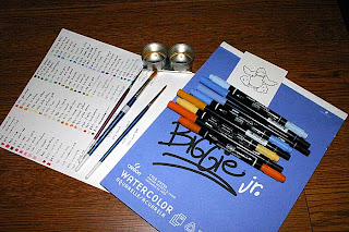
I decided to choose a simple image for part 1. A little later down the road, I will do a part 2 with a more complex image and background. As you can see, you need a decent watercolor paper, I use Biggie Jr. by Canson. It is cheap, 50 pg. for 10.00 dollars and I purchase it at my not so local fine art store. Not all watercolor papers are created equal in the case of marker watercolors. Some papers have the ink soak in too fast making it impossible to move the color! The second item you need is water based markers. I use Tombow and Stampin'Up! markers which are excellent quality and highly pigmented. Again bold color gives you bold results, and though expensive, these markers are worth it! Finally you need some good brushes and water resistant ink! I use artist quality sable brushes. These are mine from when I did watercolor. They are 20 years old and still going strong. I use small rounded brushes up to large rounded brushes, each one sized for different job's. I also use flat blunt tipped brushes for doing the occasional washes. Last my ink is Memories dye ink pad which resists smearing with water. I have Staz-on but use it rarely due to the habit it has of staining my rubber. In the picture you will also see a chart I have made with a scribble and a name and number of each marker that I own. This makes it easy for me to find the right color, The cap rarely gives a true representation of the color.

Before I start my initial coloring, I look at the image and try to determine what colors I will need. I usually choose 3 colors in each needed value. For instance the beak, I will use A light, a medium and a dark. I chose for this a pale yellow, medium orange, and a orange/red . All colors which are used to form each other.
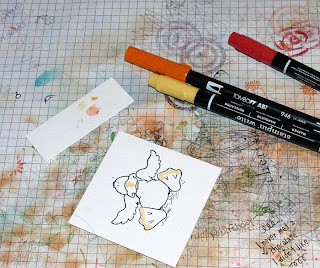
I start by working in sections. It is often advisable when you start to do small sections at a time. This is because you may be more hesitant and take more time letting the ink on other sections sink in and become less movable. I start by laying down the lightest color in a scribble in the areas I think should stay lighter. You can also leave these areas blank to allow a thin wash of your darker color to cover.
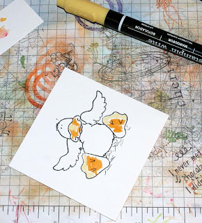
I add in my middle color, following the contours and areas I think should be shaded.
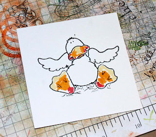
Last I add my darkest color. It is now ready to blend. Because the area is small I will choose a small brush for the area. I make sure the brush is not so wet that it drips, but not so dry that the bristles become separated. I usually use the back of my hand to determine the wetness.
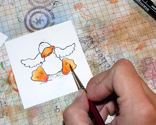


I work in a circular motion to get good blending. The circles I use are tight and controlled. My brush is held at approximately 45 degree angle. I hold lower down for control. I start in the light area, move down to the dark area, move back up to the medium area then clean off my brush so as not to darken my light value to much. I then take my clean brush and clean up the line between the medium and the light. Any mistakes can be fixed by adding a drop of water to the offending area, and soaking it up with a rag or Kleenex.

Basic Marker Tutorial 1b

I then move on to the next part of the image. The duck is white, but the white will need shadow to give it dimension. I decide on some blue-violet. I follow all the areas that I think should have shadow, that means creases of wing, under the chin, where he sits, the belly lines. All of this will make him look more real. I use only 2 blues, a light and a dark, relying on my white to blend into the lightest color. The darkest areas are of course those closest to the areas casting the shadow.
I blend it in with water, starting with the lightest to the darkest, back to the lightest and then cleaning my brush to blend the lightest into the white.
Last I need to do the hay. I pick colors which best represent hay, Yellows and Ochres. Darkest under the duck and out to the lightest. I use quick strokes or scribbles, I try to keep it loose and flowing.
After it is blended according to my earlier method I consider him ready to use. At this point I would either cut him out, or I would continue on to make a background. I will get more into that on part 2 of this tutorial.
Finally I photographed my method for organizing my watercolor markers. They are arranged in six color groups: earth tones, Yellow/oranges, greens, blues, violets, and red/pinks. It's not perfect but then I also have my chart to rely on to easily find the colors I want! I hope this helps out and shows you how easy this stunning technique is!


Recipe:

Stamps: High Hopes Rubber Stamps

Ink : Memories Dye Ink

Markers: Tombow: 553,946,026. Stampin'Up! Barely Banana, Ballet Blue, Ruby Red, So Saffron, More Mustard.

Wednesday, August 29, 2007

Sketch Challenge 139

I did two cards today. The first was actually the poppy card and the second was the cherry card. The poppy did not quite follow the sketch properly which is why I did the second card, which is also not perfect to the sketch. The recipe to the cherry card is here It actually looks a lot better in person. There is spica red glitter pen outlining the cherries in the bowl and then crystal effects is placed on top. They look shiny and delicious. The stems of the larger cherry is also outlined with the Spica glitter pens. These pens are amazing, so much better than the Sakura! The little cherries are painted in with Twinkling H2O's to give them a nice shimmer. The poppy card recipe is here . It is also painted with Twinkling H2O's over Copic markers. It is a distressed card and fairly simple. Anyway, I'm going to bed and I hope you all have a great night!


Tuesday, August 28, 2007

Color challenge 129 tweaked


I'm sick with the most irritating cold, I'm trying to get ready for a craft fair, as well as two up-coming library classes, and I decided I needed to take a break and do something fun. Have you ever tried to make a card and it turned out totally different then what you envisioned? That's what I had with this one. I started with the teapot and wanted to use it with the color challenge. Well I did a background with Winter Roses and it turned out to bold for my little teapot. Next I decided to do a different image for my bold background. I did a penny Black Hedgehog, but it did not look that great with the color combo, So I tried it with a different card back which was this one. But the background turned out so pretty that it seemed a shame to cover it all up, So back to my teapot. And after adding and taking away so many times I ended up with this, and i don't even know if I like it!!!
recipe:
Stamps: Lockhart Teapot, SU Winter Roses sentiment
CS : Chocolate Chip, Old Olive, Pretty pinkish Bazill, Pomegranate, Chatterbox DP
Ink : Wasabi, Moss
Other : copic markers, Prima flowers, May Art ribbon, sequences, SU ribbon, sewing machine, hardware, square scallop punch.
The DP paper and SU ribbon are sewn on. I added Chocolate Chip because I was compelled despite the challenge. Sequences are glued on. Otherwise it is pretty straight forward.
Have a great Tuesday.

Saturday, August 25, 2007

Husbands Birthday

Now I realize that this is not what one would call a masculine card, but believe it or not, my husband really likes these House of Mouse images! When he first saw me going through the catalogue, he came over to investigate, and was getting quite a laugh out of the images. I took this as a good sign seeing that for the most part he doesn't take much interest in my hobby except to admire my work when I request his opinion! So I decided to make him this cupcake image. After I colored it in I realized that Pinkish was the only color to work with it.
Recipe:
Stamps: House of Mouse, SU Itty Bitty Background
CS : Cameo Coral, Close to Cocoa, Confetti, Saffron DP, Au Chocolat DP
Othr : Copic Markers, Faber and Castel pencils, Gamsol, Airbrush tool, Gold brads, May Art Ribbon, blending stubs, stickles.

The image was colored in with Copic markers, and then the frosting was accented with the Faber Castel Color pencils and Gamsol. I then stamped out a second image, colored portions and cut out the pieces that I wanted to raise. The heads and arms of each mouse is raised, a piece of the cupcake, and the candle which is lying down. Before adhering these pieces I created a mask and airbrushed the background. I then adhered the pieces with two thicknesses of dimensional. I used regular glue dots and 1/16" thickness dimensional which are great when you don't want the bulk of regular dimensional. Stickles were used to highlight the cupcake icing and then all the layers were put together. Enjoy and have a great night!

Thursday, August 23, 2007

MFT Thursday

Well now I can do titles, but I can't think of decent titles. So I'm kinda stuck with a obvious kinda lame title. Oh well. Tonight I decided to keep the card clean, No distressing, no ageing, and not to many layers. I figured the image could stand pretty well on its own.
Recipe:
Stamps: My Favorite Things
CS : Sky Blue CS and DP, Real Red, Whisper White, water color paper, Au Chocolat DP
Ink : Memories black die ink, Ranger Adirondacks in Espresso
Other : May art Ribbon, Tombow Markers, SU markers, Spica glitter pens, Silver brads
Its been a while since I have used my markers. I've been so involved with my Copics that I have neglected my watercolor markers shamefully. I really enjoyed not having to work at lightening speeds. I hope you enjoy and have a nice evening.

In Need Of A Good Laugh?

I am sadly unable to post any of the stuff I'm working on tonight as it is due for a contest. But my Husband came across something that when I read it had me laughing hysterically. You have got to check out this Ebay Auction, which the lady writes a little story for. Read the whole description, trust me that it is very funny ebay . Then there is a link to her Blog which though not stamping related is quite a great read. Please check it out and enjoy!!

Tuesday, August 21, 2007

Altered DVD tin

I've done quite a few altered altoid tins, but this is my first time working with a DVD tin. I found it trickier because of the larger size and having to do the inside. I am planning on adding a note pad but so far have not found one the right size! I figured though that since I don't know how long it will take to find one I better post now and then show it again later when I find the pad! It is quite a cute idea and I will definitely keep on playing with DVD tins until I get the hang of it.
Recipe:
stamps: Lockhart Pencils, SU Baroque Motifs, Karen Foster snap stamps mini formal.
CS : Petals and Paisley DP, Rose Red DP, Cool Caribbean, Wasabi
Ink : Ranger Adirondacks Black
Other : Winter Mini ribbon, SEI Brads, Copic markers, Airbrush system, Sewing Machine
The layers are adhered with Crystal Effects. There is sewing along the front cover, The image was colored with co-ordinating Copic markers, then a mask was made and the airbrush applied.
I hope you enjoy my first attempt at Altering DVD tins. Cheers and have a nice day.


Monday, August 20, 2007

I was working today and yesterday on my father's birthday card. Now his birthday isn't until October, but I figured that I could get a bit of a head start on it. I tried to make it masculine, my father loves lighthouses and boats and anything to do with the ocean. I steered clear of ribbon, and tried to bring in the feel of the lighthouse keeper. Warm flannel background, embossing to simulate waves, A life preserver which might be found on his dingy and stitching to give the feel of stitching on a canvas sail. The image is colored with Copic markers and the air brush system. I had a great time with the coloring, and it was my first try doing a sunset with airbrush. It is not perfect, but I am still learning.
Recipe:
Stamps: Karen Lockhart Lighthouse and sentiment, SU Flannel BG, SU By Sea
CS : Night of Navy, Brocade Blue, Bordering Blue, Real Red, Whisper White, Very Vanilla
Other : Embroidery thread, Copper Brad, Cuttlebug swirl embossing folder, Copic Markers, Air
airbrush attachment, Photo corner Quickutz, Piercing tool and mat.
The cross stitch is done by hand, I pierced the paper and then sat and embroidered. I think my husband thinks I'm going loopy. The coloring was thoroughly enjoyable, I played with the shadows and light. I hope you enjoy looking and that you have yourselves a great day.

Friday, August 17, 2007

Stampers Club

One of the biggest things that I struggle with each month is coming up with approachable and nice cards for Stampers Club, Workshops and beginner classes. I love doing my own thing, but a lot of the stuff I do has taken years of practice to achieve and can't be taught to a beginner. Its not that it is hard, just I find intimidating to someone who hasn't stamped before. So the first place I go when I need inspiration for a Class is Andrea's Stamping Blog . She is an absolute wiz at teaching both new and experienced stampers, and she is also my Upline. She has totally mastered simple and elegant which for me is one of the hardest things to do.
This first lady bug card is almost a total case from Andrea's lady bug card .
I just tweaked it a bit and changed some stamps and colors. I used Carte Postal for the background, Pick a Petal for the bug, and Stem sayings for the trail and greeting. Stem sayings is embossed and the colors used are River Rock, Wasabi, Black, Rose Red DP. Ink colors are the same except that I sponged with Caramel.


This next one is showcasing the cracked glass technique. Once again I drew on Adrea for inspiration. I loved this card that she did. I wanted to get the same feel with my own touches. The colors used are Natural, Wasabi, Groovy Guava, Rose Red DP. Ink colors are the same except I added Caramel for sponging. The set used is Pick a Petal.


The last project is a little box that I downloaded from Splitcoast. I used the Very Punny set (because I still have some to sell to customers) and the Pick a Petal for the topper. I accidentally used Pomegranate for the top bug when I should have used red. I didn't have time to fix it but will get my customers to use the red ink to match the ribbon. The bottom bugs are colored with Blender pen and markers.

I thought that I would share this with you so that you can see what i have been up to, but also to give you an idea of my struggles and also the kind of day to day stamping I do for my business.Thanks so much and have a great day!

Thursday, August 16, 2007

Still Coloring


I am a big fan of the House of Mouse images! I find them so whimsical and cute! They recently had a sale where when you buy three you get one free. I decided to add a wee bit to my collection.
recipe:
Stamps: House of Mouse, Lockhart sentiment
Paper : Close to Cocoa, Bashful Blue, Brocade Blue, Whisper White, Basic Grey DP, Unknown
brown.
Ink : Ranger Adirondacks black, Basic Brown
Other : Copic markers, Faber Castel color pencils, Prisma color pencils, Dazzling diamond,
ribbon, copper brads.
To color these images, I usually use a mix of media. In this case i started with a base of Copic markers, in a variety of Earth tones, and Blue greens. There is a touch of the red family used on the cheeks and ears. I then went over all the areas with the color pencils. I use short strokes on the fur to simulate the texture of real fur. I follow the shadow lines using colored pencils in a deeper shade of the same color. I highlighted the toothpaste with glitter. The edges are inked with Ranger Tea dye distress ink using a sponge dabber. A little extra touch of piercing was added to the right corners of the card using Ornare piercing template. I find it adds a little touch of interest.
Thanks so much for your interest, and enjoy!

Wednesday, August 15, 2007

Yup, I'm still Alive!


Where have I been? At the moment I have no idea. I finally went out and got a fancy card reader which will download 200 pictures in about 5 seconds. With that resolved I figured that I would be able to get up to posting on my blog. Then Life caught up with me and I was swamped. I have been frantically trying to prepare for my Friday's Stampers Club, prepare samples for my up-coming Library class, prepare cards and altered objects for a designer contest and basically be busy! Now I know that I have not been posting to any Blogs lately, please don't think that its because I'm not looking! I have been faithfully looking at all you guys daily, its just that with everything on my plate I have been unable to take the time needed to comment (my computer can be really slow sometimes). I will be back to commenting on all the amazing stuff I have been seeing, but until I clear off my desk of necessary projects I will be unable too. Oh ya and on an up note, I'm so excited that Scor-Pal found one of my cards through Beate's challenge and asked to put it in their new gallery! How cool is that. I absolutely love that tool, and now I have something showcased for them!!
As to this card that I made on Saturday. It is fast and was kinda a warm-up. It was really simple but fun. I have always loved coloring, so this was right up my ally.
recipe:
stamps: Lockhart
Paper: drk Brown unknown, Pumpkin Pie, Daisy D DP, Whisper White
Ink : Ranger Adirondacks black, Cool Caribbean, Ranger Distress in Tea Dye and Vintage
Other: Copic Markers (my new favs.), Decorative pearls, May Art ribbon, decorative scissors.
Sakura stardust pen.
I hope you enjoy what you see and i can't wait to show you the more intricate stuff after I enter it in the contest!

Monday, August 13, 2007

I'm back, but can't upload photo's

Ack, believe it or not I'm back, and I've had time to stamp, except that I can't post it. It would seem that either my dear husband or I left the cable that connects the camera to the computer behind. Now I personally can say that I have not touched it the entire trip. I can also say that though I don't know for sure about my husband, I'm inclined to blame him for either mispacking it or leaving it behind somewhere! Therefore as soon as I can a) find it b) buy one or c) have mine mailed to me if it is missing then I am unable to post pictures.
Anyhoo for anyone who is interested in knowing, my vacation was great except for one great flaw..................I could not stamp! I had some great new stamping products, but no where to stamp. My sisters stamp room was under renovations headed by my husband, and her husband. Argggg, talk about miserable timing. My dad's house of course has no stamp room. Well there is no place like home, I can't wait to stamp some more, that means more stuff to upload when we get the darn camera sorted out!